Comprehensive Data Visualization Project Using Tableau Public and Microsoft SQL Server
In this project, I developed interactive data visualizations using Tableau Public and integrated them into a web-based platform. The project aimed to showcase my ability to work with data from querying and analysis to creating meaningful visual representations that can be shared and interpreted effectively.
The project began with the data querying process from a Microsoft SQL Server database. To analyze the dataset, I crafted custom SQL queries within SQL Server Management Studio. This phase allowed me to explore the data in its raw form, apply necessary transformations, and filter the dataset based on specific criteria to extract key insights. The challenge of structuring complex queries helped me enhance my proficiency in SQL and understand the importance of properly cleaned and organized data for analysis.
Due to limitations with Tableau Public, which does not support direct querying from SQL Server, I imported the query results into Microsoft Excel as an intermediary step. This step involved data cleaning, handling missing values, and ensuring that the dataset was in an optimal format for visualization. Once the data was prepared in Excel, I brought it into Tableau Public, where I started the core work of the project—visualizing the data.
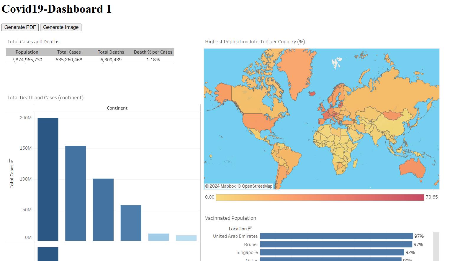
Using Tableau, I designed a simple but effective dashboard that presented the data in an interactive and user-friendly format. I employed a variety of visual components, such as bar charts, line graphs, heat maps, and pie charts, to represent different aspects of the data. The visualizations aimed to uncover trends, patterns, and outliers that would be useful for analysis and decision-making. Tableau’s interactive filters and drill-down capabilities allowed users to explore the data further, providing them with the ability to view insights at different granularities.
This project served as an excellent learning experience, helping me develop a robust understanding of the full lifecycle of data analysis and visualization. It not only taught me how to query databases and transform raw data into usable formats, but also reinforced the importance of effective data storytelling. I learned how to design dashboards that communicate complex data insights clearly and concisely, ensuring that the visualizations are not just informative, but also easy to interpret and act upon.
In addition to honing my skills in SQL and Excel, this project provided me with hands-on experience in using Tableau Public for creating compelling visualizations. I learned to harness Tableau’s powerful features, such as data blending, parameter controls, and custom calculated fields, to create meaningful visualizations that provide insights into key business metrics.
Furthermore, the project allowed me to practice web embedding of Tableau visualizations, making it possible to share the dashboard and its insights with a broader audience, including stakeholders or team members who might not have direct access to Tableau. This web embedding functionality enhances the reach and accessibility of the visualizations, allowing others to interact with the data in real-time.
Overall, this project not only deepened my technical skills in SQL, Excel, and Tableau but also helped me understand how to bridge the gap between data analysis and effective visualization. It reinforced my ability to turn raw data into actionable insights and communicate those insights through powerful, interactive dashboards. This experience is directly applicable to real-world business situations, where decision-makers rely on accurate, insightful data visualizations to guide their strategies.
You can follow
to see my project on my github
